
Do you have an idea or feeling about the color for 2016 or in general about the interior color trends for next year? Look at the contemporary trend!
12. 4. 2016
Do you have an idea or feeling about the colour for 2016? In general, about the home decor colour trends for next year?
For sure, there are some colour trends that have an high influence over all furniture, textiles, home accessories new collections, that we find first in trade fairs and in magazines, then in the shops.
Dulux is the bigger paint company in the Uk and it engages every year a special commission of design and architecture expert, called the AkzoNobel’s Global Aesthetic Center, to predict future trends in term of colour.
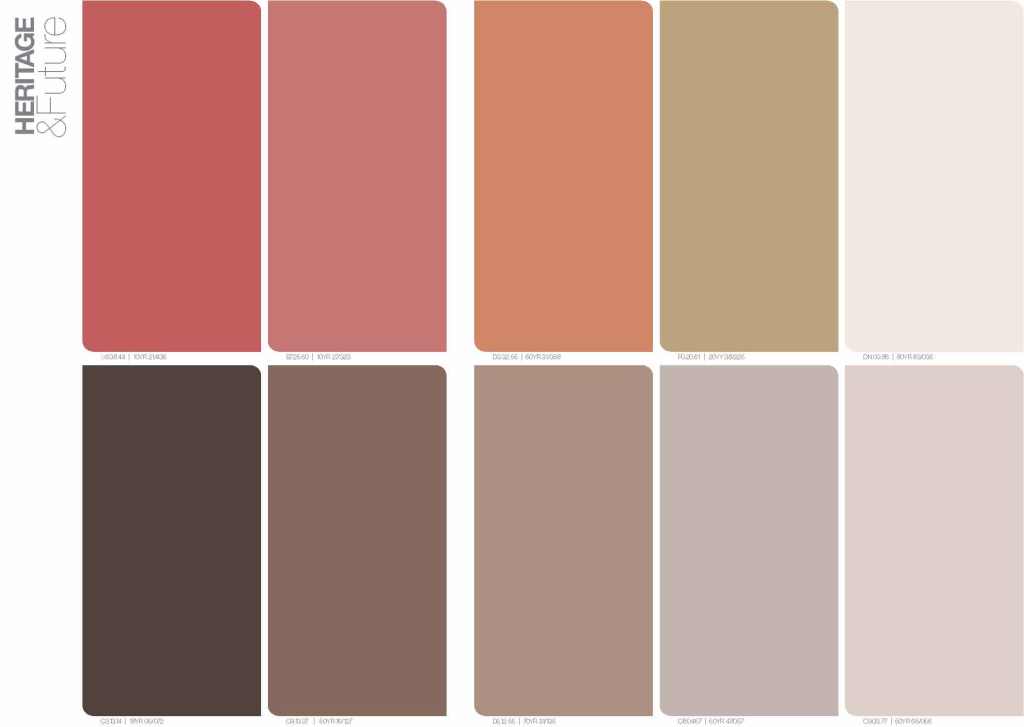
It will be a warm year, with a predominant colour shade…not yellow, not beige, not gold: it’s ‘”ochre gold” !
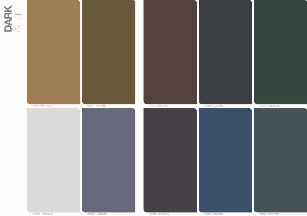
For 2016 we see a muted and sophisticated palette which centres on soft mid tone shades. The overall feeling continues to be warm, but with even greater subtlety. Bright colours have moved away from primary to something more interesting. Think coral, not orange; ochre not yellow and midnight, not blue. This is a friendly palette but with a dark, mysterious side.
We have selected a gold influenced ochre which is both bright enough to attract attention and combines well with other tones…

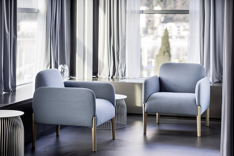
Join armchairs by LaCividina
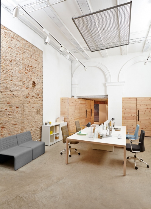
Prisma desk, Shey armchairs and Cron task chair by Actiu

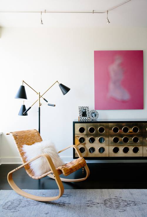
Dondolo armchair by Crassevig
Anna chairs and table by Crassevig
Ala armchair by LaCividina
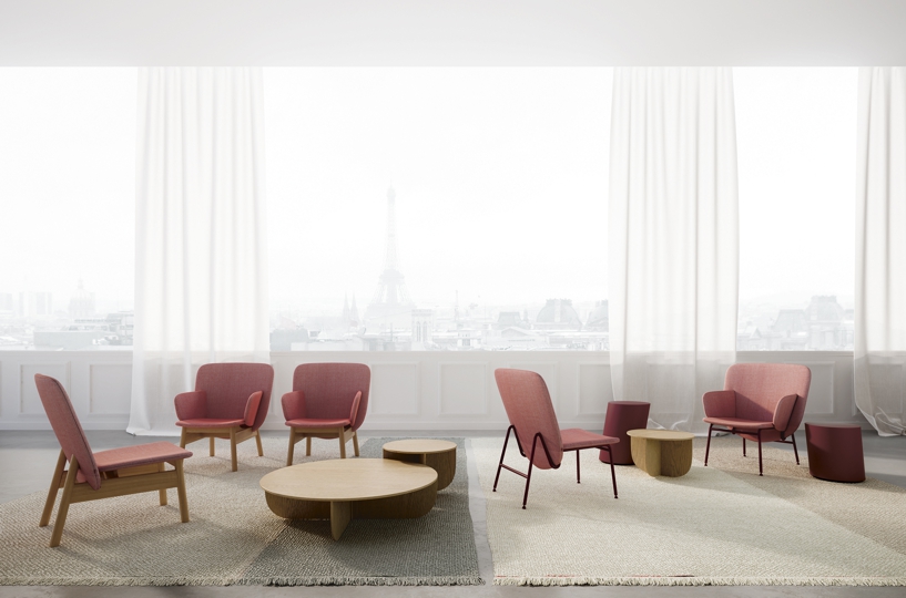
Silas space collection by Gan Rugs
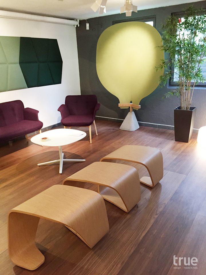
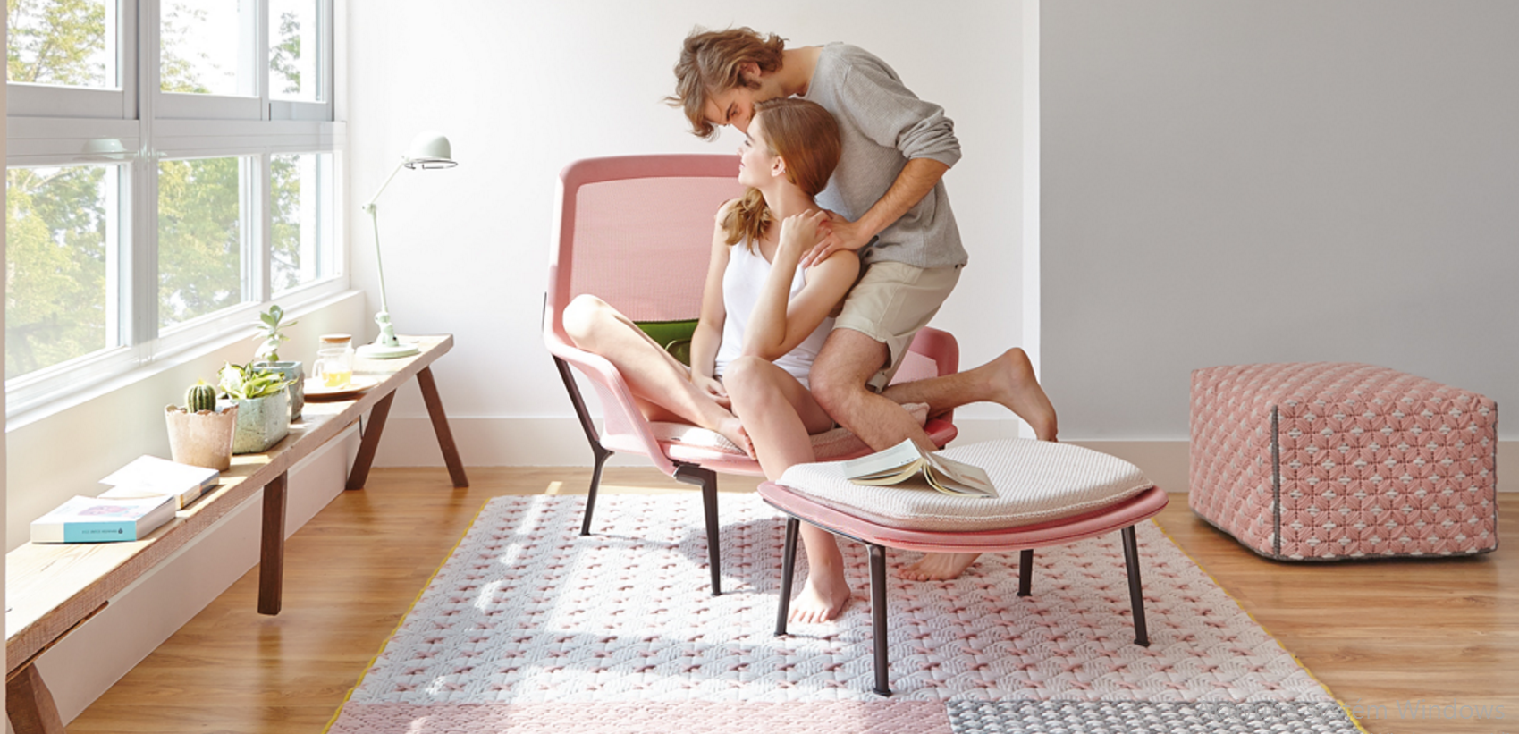
True design in action - DNA, Vague, Pincettes a Wrap


